#week 6 — Frontend Graphs, Visual Clarity & Data Consistency Battles

Week 6 was all about bringing CodeAtlas to life on the frontend. After stabilizing the backend and data pipelines last week, I finally started visualizing the data—turning raw Neo4j relationships into an interactive graph UI.
This week had some satisfying visual wins, but also exposed a critical lesson: data consistency between frontend state and Neo4j matters more than visuals.
From canvas rendering to graph coloring, from repo-switching bugs to wiping databases clean—this week was a full frontend + data debugging sprint.
1. Starting Frontend Graph Visualization
The main focus this week was frontend graph rendering.
Graph Canvas: Before & After
I began by integrating graph data into the canvas. The initial version was functional but messy—nodes overlapped, relationships were unclear, and everything looked… confusing.
After iteration:
Improved node spacing
Cleaner edge rendering
Better zoom & pan behavior
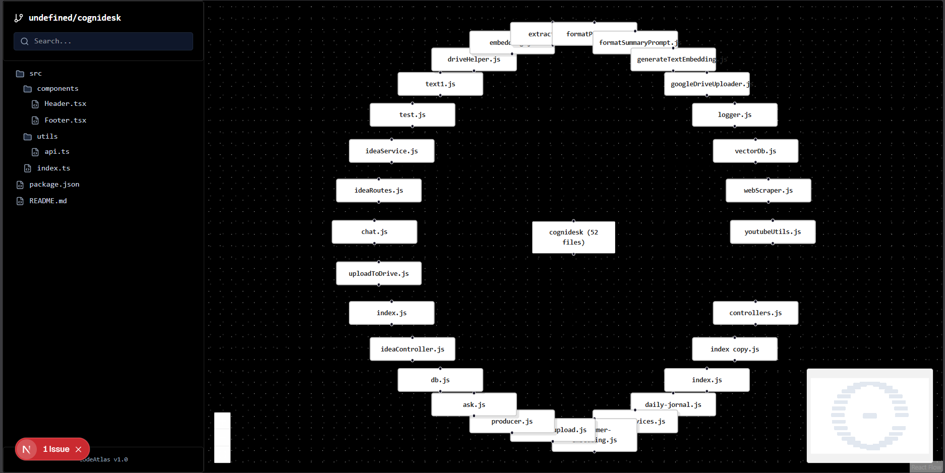
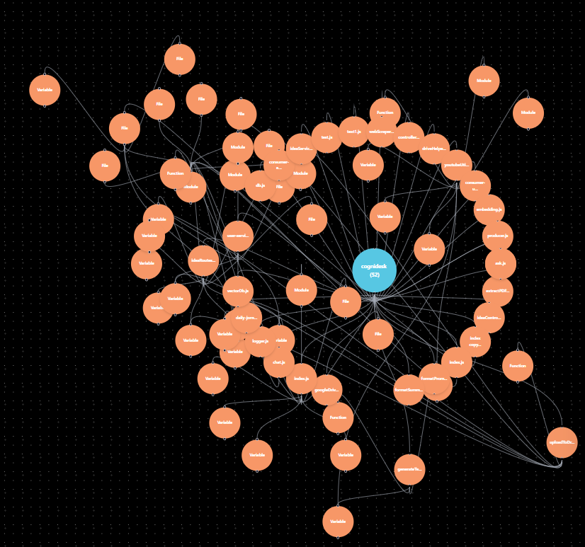
This was the first moment CodeAtlas actually felt real.
2. Loading Neo4j Data for Graph Rendering
Once the canvas was ready, the next challenge was loading graph data correctly.
Initial Approach
Load all nodes
Load all relationships
Render everything at once
The Issue
This caused:
Performance issues
Overloaded graphs
Difficulty filtering meaningful connections
Fix
I changed the approach to:
Load nodes
Fetch only required relationships
Render a controlled subset of the graph
🎯 Result: Faster rendering and much clearer graph exploration.
3. Visual Differentiation: Colors & Legend
Once the data was stable, I focused on visual clarity.
Node Coloring
Different colors were assigned based on node type:
Files
Functions
Classes
Dependencies
This made the graph immediately understandable—even without reading labels.
Legend Added
To avoid confusion, I added a legend in the frontend that clearly explains:
What each color represents
How to interpret the graph
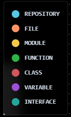
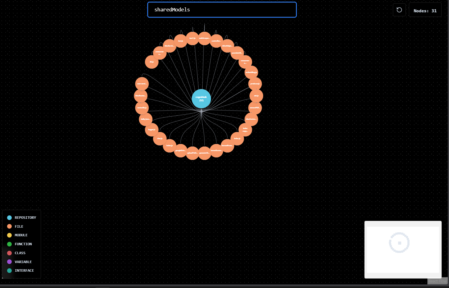
🧭 This small UI addition massively improved usability.
4. The Repo Switching Bug (Major Debugging Moment ⚠️)
Everything looked good—until I switched repositories.
The Problem
Repo A loads correctly
Switch to Repo B
Graph still shows Repo A relationships
Data looked “mixed” and incorrect
At first glance, it looked like a frontend state bug.
Root Cause
After debugging, I discovered:
When switching repos, new repo data was NOT loading into Neo4j
The frontend was querying Neo4j correctly—but Neo4j still contained old repo data
So technically:
The frontend was right. The database was wrong.
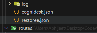
5. Temporary Fix: Separate Branch + JSON Loader
To isolate the issue:
I created a separate branch for loading a new repo
Repo data was converted into a JSON file
JSON files were stored in the
public/folder
Logic Implemented
If JSON exists → load into Neo4j
If not → throw an error
This confirmed the issue was data persistence, not rendering.
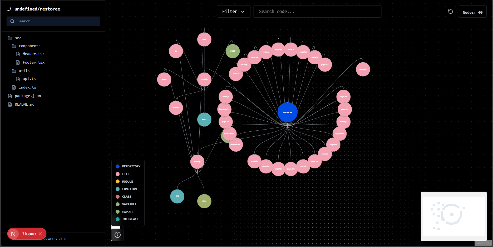
6. Duplicate & Multiple Entries in Neo4j
Once repo loading worked, another issue surfaced.
New Problem
Repo 1 exists in Neo4j
Load Repo 2
Neo4j adds data without deleting Repo 1
Result:
Duplicate nodes
Multiple relationships
Frontend filters completely break
Final Fix (The Right One ✅)
Before loading any new repo data:
Run a wipe script on Neo4j
Clear all existing nodes and relationships
Load the new repo from scratch
Now:
One repo at a time
Clean graph
Predictable frontend behavior
🎉 Result: Everything works correctly and consistently.
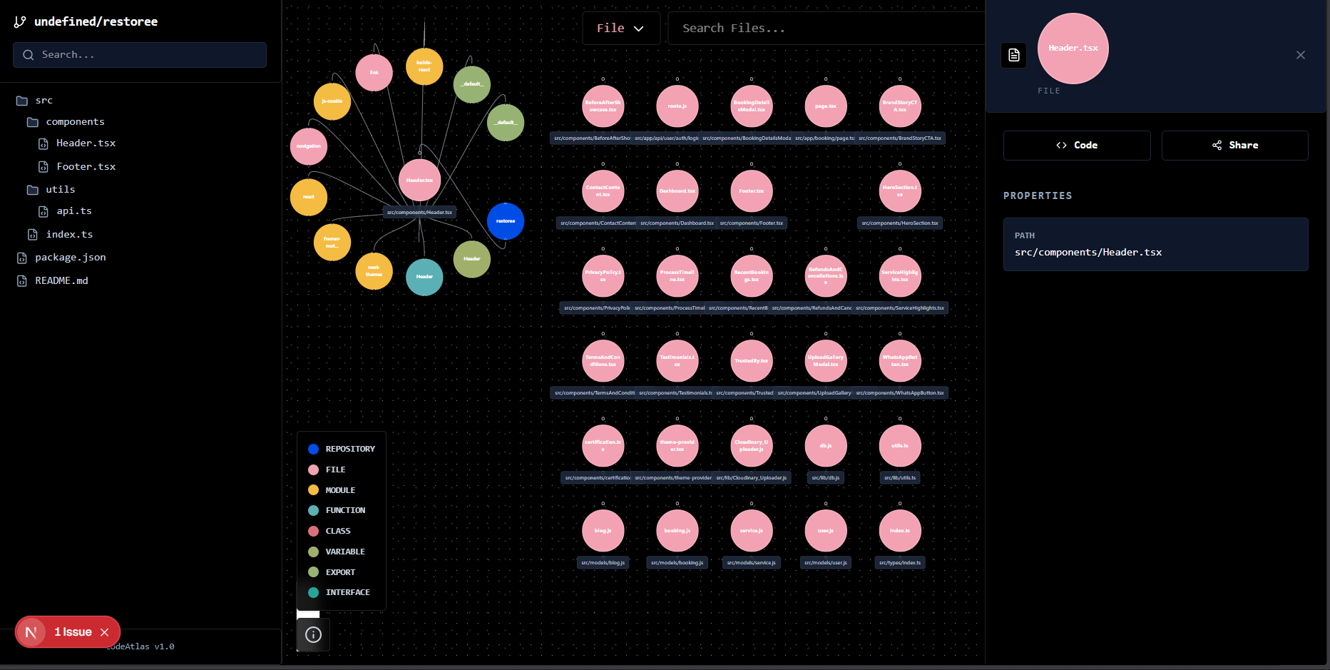
i also put the empty filter as you see some user just want to see the file it load the 30 file max
Key Takeaways
Frontend graphs are only as good as backend data consistency
Visual clarity (colors + legends) is not optional—it’s essential
Repo switching must be treated as a full state reset
Neo4j needs explicit cleanup unless multi-repo support is designed intentionally
Debugging frontend issues often leads back to data layer mistakes
What’s Coming Next (Week 7 Roadmap 🚀)
Next week, the focus shifts to user experience & intelligence:
📁 File structure visualization
🧠 AI-powered code summaries
📋 One-click code copy feature
👉 Side panel that opens on node click
File details
Function summaries
Dependencies
The goal: make CodeAtlas not just visual—but useful for real code understanding.
🤝 Contributions
Ideas, improvements, and suggestions are always welcome.
You’re encouraged to submit issues or pull requests to help evolve the platform.